Area of Design. (n.d.). Area of Design - Saul Bass.
[Accessed 10 Jan. 2023]
Art of the Title (2019). Saul Bass.
[Accessed 10 Jan. 2023]
Bigman, A. (2012). Saul Bass: the man who changed graphic design.
[Accessed 10 Jan. 2023]
British Film Institute (2006). fi | Library | Saul Bass: biography.
[Accessed 10 Jan. 2023]
Ehrlich, D. (2017). Every Movie Poster Saul Bass Ever Designed.
[Accessed 10 Jan. 2023]
The Logo Creative (2018). Legendary Logo Designer Saul Bass.
[Accessed 10 Jan. 2023]
[Accessed 10 Jan. 2023]
Art of the Title (2019). Saul Bass.
[Accessed 10 Jan. 2023]
Bigman, A. (2012). Saul Bass: the man who changed graphic design.
[Accessed 10 Jan. 2023]
British Film Institute (2006). fi | Library | Saul Bass: biography.
[Accessed 10 Jan. 2023]
Ehrlich, D. (2017). Every Movie Poster Saul Bass Ever Designed.
[Accessed 10 Jan. 2023]
The Logo Creative (2018). Legendary Logo Designer Saul Bass.
[Accessed 10 Jan. 2023]
WEBPAGES
Bass, S. (1973)
Saul Bass.
Film Dope. Aug.
Bass, S. (1994).
Credit Where Credit’s Due.
Empire. Mar.
Saul Bass.
Film Dope. Aug.
Bass, S. (1994).
Credit Where Credit’s Due.
Empire. Mar.
INTERVIEWS
Bass, J. and Kirkham, P. (2011)
Saul Bass : A Life in Film & Design.
London: Laurence King.
Horak, J.-C. (2014)
Saul Bass : Anatomy of Film Design.
Lexington: Univ. Press of Kentucky.
Saul Bass : A Life in Film & Design.
London: Laurence King.
Horak, J.-C. (2014)
Saul Bass : Anatomy of Film Design.
Lexington: Univ. Press of Kentucky.
BOOKS
BIBLIOGRAPHY
Saul Bass turned what once was mandatory beginning credits and made them part of the film experience, helping establish the setting and tone of the film. Before Bass, a film sequence was preceded by a cold open; now a spectacle to engross the viewer into the media they’re watching. Title sequences were previously projected onto the curtains in the film theatre as they were deemed so unimportant. Saul Bass changed the definition of a title sequence.
Bass received a number or awards for his work. An Academy Award (1968), Royal Designer for Industry (1965, bestowed by the Royal Society of Arts, London), and the Gold Medal of the American Institute of Graphic Arts (AIGA, 1981). The recognition which Bass received is another indication of the impact left by the revolutionary designer, being far ahead of his time.
The lasting influence and impact of Saul Bass generates clean and minimalist visual designs throughout the design world today, leaving a permanent mark on the design world.
During the period from the year 1970 to 1989, Bass had a hiatus from film, and instead created several corporate logos. The average lifespan of a logo designed by Saul Bass is estimated to be around 34 years, showing that the evergreen design work of Saul Bass is difficult to refute, even in a world-everchanging.
Bass created logos for companies such as; AT&T, Minolta, Quaker Oats and Bell System. When creating corporate logos, Bass applied his signature simplistic and minimal style, allowing the logos to stay timeless. While some of the logos have been redesigned, it has only ever been slight revisions, never straying far from the original Bass design.
AT&T: Bass designed the iconic "Death Star" logo for AT&T in the 1970s, becoming one of the most recognized corporate logos of the time. The stylized globe with a series of interconnected lines, is to symbolize the company's global reach and its role as a leader in the telecommunications industry.
Minolta: Bass designed the logo for Minolta, a Japanese manufacturer of cameras and office equipment, in the 1960s. The logo features a stylized "M" in the centre of a circle, intended to symbolize the company's focus on innovation and technology.
Quaker Oats: Bass designed the logo for Quaker Oats in the 1970s, which features a stylized Quaker hat and the word "Quaker" in bold, capital letters. The logo, which is still in use today, has become one of the most recognizable and enduring corporate logos in the world.
Bell System: Bass also designed the logo for the Bell System. The logo, which features a stylized bell inside a circle, was intended to symbolize the company's role as a leader in the telecommunications industry.
LOGOS
“Saul Bass wasn’t just an artist who contributed to the first several minutes of some of the greatest movies in history; in my opinion his body of work qualifies him as one of the best film makers of this, or any other time.”
- Steven Spielberg
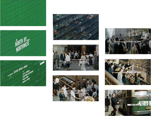
Hitchcock had been interested in graphics since his youth; he invited Bass to work on North by Northwest (1959) and Psycho (1960). Bass found himself being highly praised for the title sequence of “North by Northwest”, with the film being based around the mistaken identity of a wealthy man. Bass symbolised the film by opening to a screen of green, entrapped in a web of intersecting lines, followed by the sans serif titles rising and falling into columns. The title sequence of “North by Northwest” was the first to this kinetic type, making it revolutionary sequence.
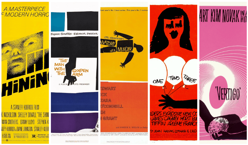
Seeing the success of the bold jagged cut-outs, Saul Bass continued apply this iconic style to his many projects, working alongside filmmakers such as; Alfred Hitchcock, Otto Perminger, Billy Wilder, Stanley Kubrick, Martin Scorsese and Steven Spielburg.
Seeing the success of the bold jagged cut-outs, Saul Bass continued apply this iconic style to his many projects, working alongside filmmakers such as; Alfred Hitchcock, Otto Perminger, Billy Wilder, Stanley Kubrick, Martin Scorsese and Steven Spielburg.
Perminger’s commission gave Bass the opportunity to create a title sequence which would enhance the experience for the audience and contribute to the mood and theme of the movie within the opening moments.
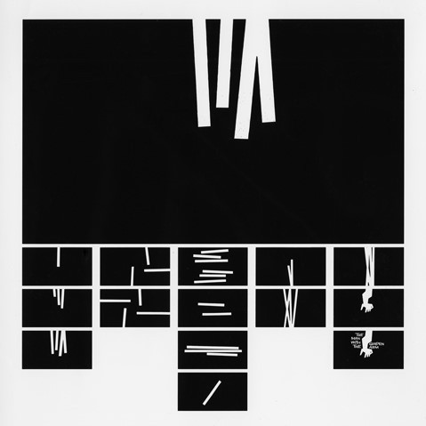
Bass became widely known after arguably his most well-known title sequence, “The Man with the Golden Arm”. The sequence begins in stop-motion; a series of white block cut-outs moving in and out of frame on the black screen forming abstract patterns, followed by a warped arm cut-out emerging from the top of the frame. The black and white contrast adds to the intensity of the title sequence. The abstract, disjointed patterns followed by the arm are used to visualise the disjointed life of an addict. The contorted arm helps to distance the image from reality, yet still able to convey drug usage.
Bass stated that the title sequence, “in an abstract way, attempted to convey the distortion and jaggedness, the disconnectedness and disjointedness of the addict’s life—the subject of the film. Otto Perminger made sure that the film was accompanied with a note telling the projectionist to “open the curtains before starting the film”.
TITLE SEQUENCES
“My initial thoughts about what a title can do was to set mood and the prime underlying core of the film’s story, to express the story in some metaphorical way.
I saw the title as a way of conditioning the audience, so that when the film actually began, viewers would already have an emotional resonance with it.”
I saw the title as a way of conditioning the audience, so that when the film actually began, viewers would already have an emotional resonance with it.”
- Saul Bass
IMPACT MEDIA?
SAUL BASS
HOW DID
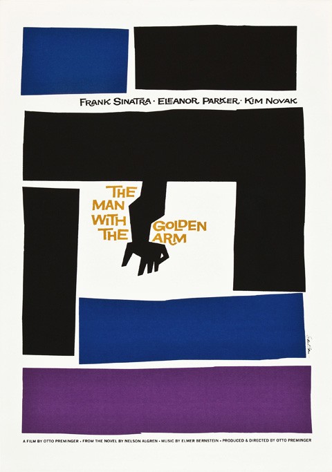
“The Man with the Golden Arm (1955)” poster is a well-known piece from Saul Bass. Directed by Otto Perminger, the film is about a musician’s struggle with heroin. Bass designed a simple yet shocking poster for the film; a crooked arm surrounded by san-serif type and geometric blocks of colour - an iconic poster which symbolised the movie. Preminger was impressed with Bass’ ability to summarise and symbolise the movie into a strong visual, and further commissioned Bass to create the title sequence for the film.
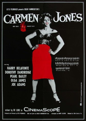
Bass’ first breakthrough design of the “Carmen Jones (1954)” film poster was shockingly simple; actress Dorothy Dandridge pictured in black and white, with the red of her lips and skirt reflecting the fiery character within the film. Bass continued to create minimalistic posters with a bold limited colour palette. These palettes consisted of black, white and a contrastive colour, to allow for a dominant background colour with black shapes overlaid on top. The use of negative space alongside the image and the colours allows the poster to breathe, as to not overwhelm the viewer, while still being striking compared to the safe romantic posters of the time.
During the 50’s, movies were portrayed in a romantic style, using an array of colours and detailed illustrations to entice the viewer to such an appealing poster, wishing to view the film. The goal of Bass was to convey the main ideas, themes, and tone of the movie into as simple of an image as possible. Bass was taking a serious risk with summarisation and symbolism of the movies main themes, all in one image.
POSTERS
“If it’s simple simple, it’s boring… we try for the idea that is so simple that it will make you think and rethink.”
- Saul Bass
Drawing from a young age, Saul Bass (1920 – 1996) exhibited his artistic talent, covering any clean surfaces with sketches. Bass graduated from James Monroe high school at the age of 15 and went on to attend the Art Students League in Manhattan part-time, spending the rest of his time attending night classes at Brooklyn college with his mentor György Kepes (a famous Hungarian designer and a master of the utilitarian Bauhaus design). Only after a few advertising projects, Bass received a job at Warner Bros.
Within the 1940’s Bass took up Hollywood projects, which involved the print work for promotional purposes; chevrons for aircraft tails, Art and Architecture magazine covers record covers and posters. Bass started his own practice in 1952, with a few years later establishing a private firm; ‘Saul Bass & Associates’. During this time, Bass was a regular guest at design conferences, in which he would speak of his main inspirers and inspirations, the Arts and Crafts and Bauhaus movements.
Within the 1940’s Bass took up Hollywood projects, which involved the print work for promotional purposes; chevrons for aircraft tails, Art and Architecture magazine covers record covers and posters. Bass started his own practice in 1952, with a few years later establishing a private firm; ‘Saul Bass & Associates’. During this time, Bass was a regular guest at design conferences, in which he would speak of his main inspirers and inspirations, the Arts and Crafts and Bauhaus movements.
ABOUT BASS

With the works of Saul Bass being that of minimalistic flat colour, it wouldn’t be any wonder as to why one may question the high praise towards what is seemingly the bare minimum of the marketing heavy mediums that surround us in the present. What impact did Saul Bass leave on the design industry?
IMPACT MEDIA?
SAUL BASS
HOW DID